From paper to fabric: Part II of the Bulgarian T-Shirt project

A little while ago I shared how a holiday in Bulgaria sparked a new creative project. Inspired by a fantastic performance of traditional dance, music and traditional costumes, I drew an illustration of a Bulgarian couple dressed in traditional clothing. The drawing turned out so well that I started to wonder: What if I put this design on a T-shirt? In a previous post, I left off at the point where I was still debating between digitizing a hand-painted version or going fully digital.
A summer break
Since then, the project has undergone some further steps—though with a small pause in between. Summer called and we went on a cyclingtrip through Sweden. From Denmark we cycled around 1700 km, folowing the south coast to Kalmar, exploring the island of Öland, paddling Åsnen lakes, and eventually making our way across the country to the west coast looping back via Helsingborg and Copenhagen. A completely different experience from Bulgaria, less about cultural immersion, more about endless forests, calm lakes, and wildcamping. It inspired me for some drawings, but in another way. But that’s a story for another blog.
Handpainted or digital?
Back home, it was time to pick up "the T-shirt project", as I started to call this exploration again. The big question I still had was: should I use the digital version of my drawing, or try to preserve the character of the handpainted original? The more I compared the two, the more I realized how much charm the aquarel and fineliner textures added. So I decided to dive into a process I wasn’t very familiar with: how to properly digitize a hand-painted illustration while keeping as much of its detail as possible?
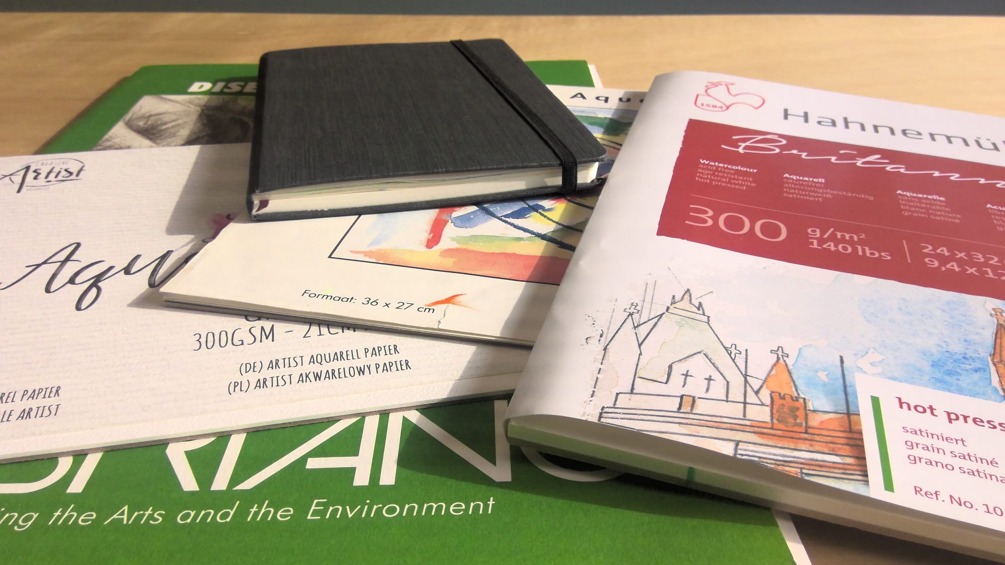
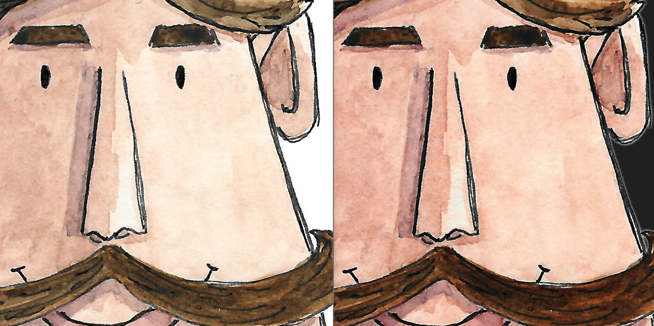
The first step was scanning. At first, I simply placed my sketch under the scanner to see what would happen. The results were fine, but after doing some research, I discovered I wasn’t even using the scanner to its full potential. Adjusting the settings, it already gave me a cleaner, sharper result, but it still felt a bit grainy. That made me wonder: was the paper itself part of the problem?
Paper Matters
So my exploration continued. I began a little paper experiment. I tested different surfaces, cold pressed versus hot pressed paper, to see which one would give the best results. For this project, I chose Hahnemühle Aquarell Britannia 300gsm, hot pressed paper to continue with. The smooth surface worked very well for detailed fineliner lines, even tough it absorbed less water than rougher paper. The real advantage revealed itself during scanning: unlike textured paper, which creates tiny shadows by the fibers, the hot-pressed surface gave me a crisp result that was much easier to refine digitally.
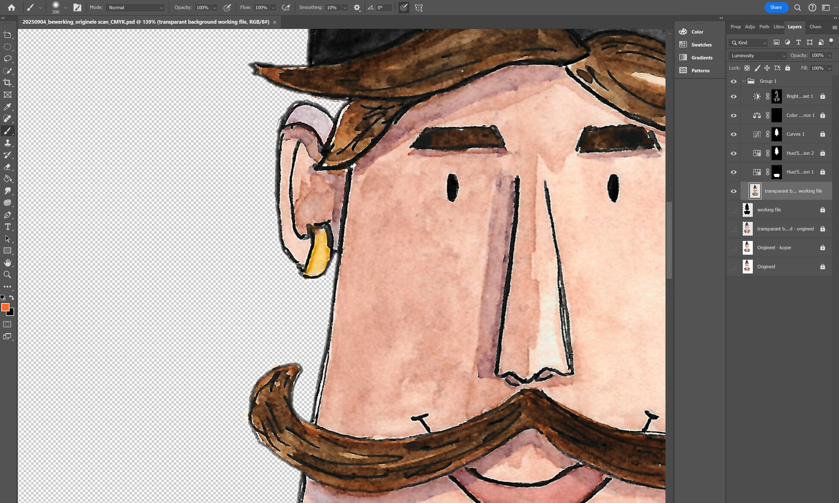
Next came Photoshop. To prepare the design for printing, I needed a transparent background. Nobody wants a big white rectangle around their artwork on a T-shirt. With this new scan, removing the background became manageable. I also gave the colors some very subtle adjustments. Scanning had made the paint appear slightly cooler and patchier than in the origional, so I gently warmed things up again and softened the contrasts. Along the way, I made the choise to left out the female dancer from the original pair. With just the male dancer, the composition felt calmer and more balanced for a first experiment.
Picking the right background color and placing an order
Finally, I was happy with the result and a t-shirt had to be chosen. Which color? After comparing options, I picked a warm sand tone. Against this background, the Bulgarian dancer really stood out, while still feeling harmonious with the original aquarel hues. With everything prepared, I placed the order.
And now, the waiting has begun... The T-shirt is on its way! I won’t be the one wearing it (that honor goes to Rony), but I’m very curious to see how it looks in real life, and whether anyone will notice or even comment on it. Honestly, both silence and compliments would make me happy: either the design feels so natural it “just belongs” on a shirt, or it stands out enough to spark a reaction. Either way, I’ll take it. But first things first: let’s see how this first shirt turns out. Stay tuned for the next chapter!