A winter wonderland Down Under

When I first received the request to design a set of Christmas cards with the theme “Winter in Sydney” I couldn’t help but raise an eyebrow. Winter? In Australia? What kind of winter are we talking about here? After all, when most of us imagine Christmas in Sydney, we think of beach days, barbecues and sunshine. Not snowflakes or icy landscapes.
But as the idea started to sink in, my curiosity took over. If “winter in Sydney” doesn’t mean snow outside your window, maybe it’s about the imagination what winter could look like there. And with that thought, the creative process began.
Reference photos and an inspiring tutorial
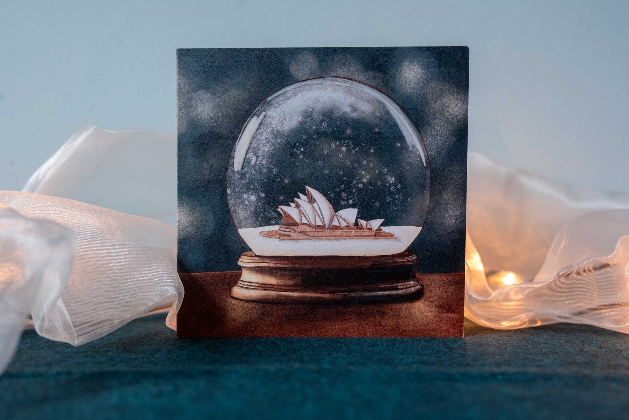
I started by collecting reference photos of Sydney: the skyline, coastline, some animals, and the Opera House. I also asked the client about the places they loved most, hoping to capture something personal in the design. My notebook filled with some loose notes and rough ideas, but I quickly transitioned to working digitally to refine one of the ideas that came to my mind.
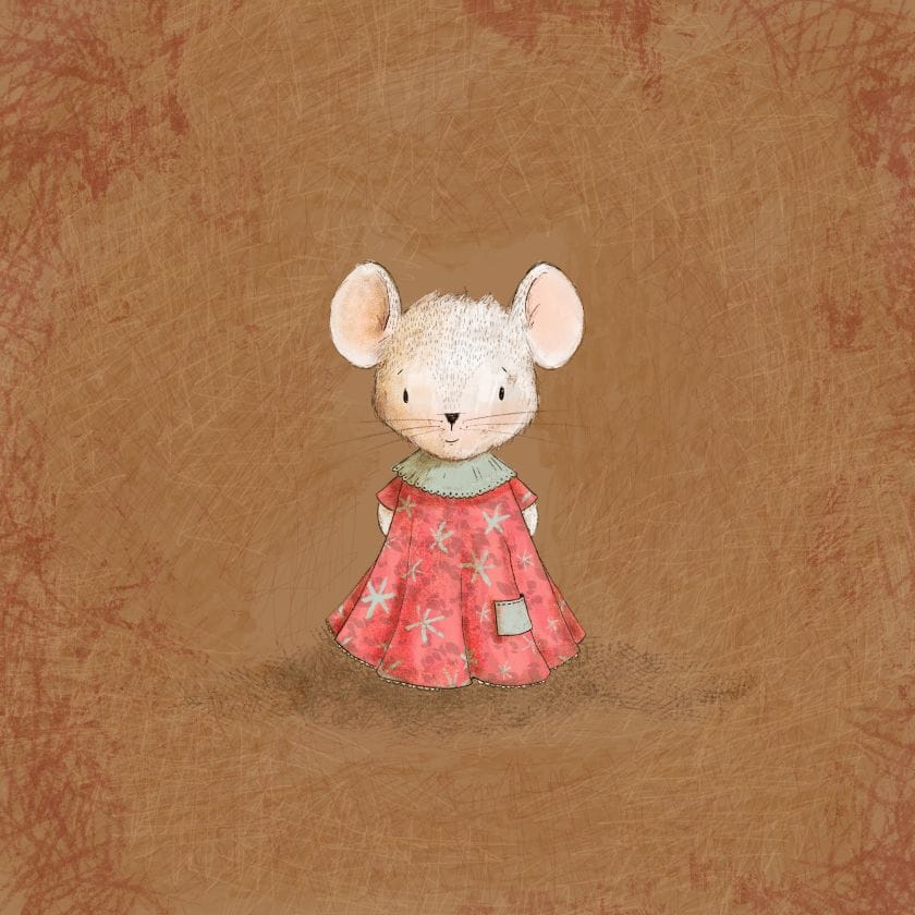
A tutorial by Lisa Glanz, in which she illustrated a charming little mouse in a dress, inspired me to try something new. Instead of my usual black fineliner outlines, I decided to build the drawing using a brown pencil. A bit softer and maybe warmer, but still quite natural.
Playing with color and contrast
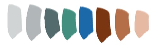
The next challenge was the color palette. I wanted to blend the warmth of Australia’s tones. I chose burnt oranges and browns that made me think of the dry landscapes and combined these with cool winter blues and greys. I limited myself to 8 base colors and use them for both designs. It’s funny how complementary colors can tell a story together: blue and orange sit opposite each other on the color wheel, but when they meet, they make each other shine. Later, when I saw a kingfisher flying across the water, I suddenly realised that the colour combination I was using also occurs naturally. And that same brightness and vibrance that I saw in the bird as it flew by is also reflected in the postcard.
Creating a winter dream
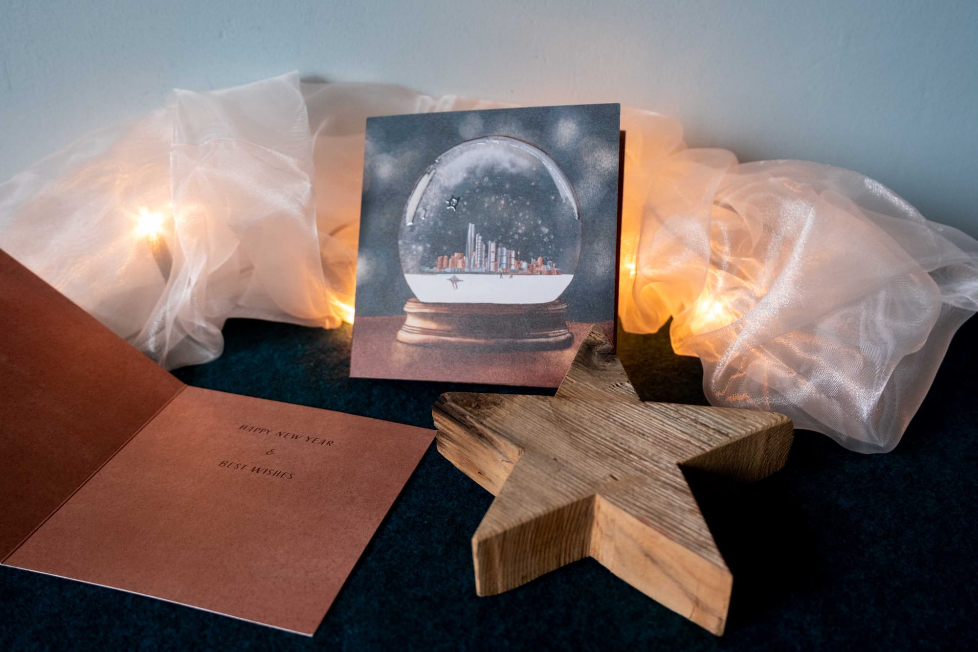
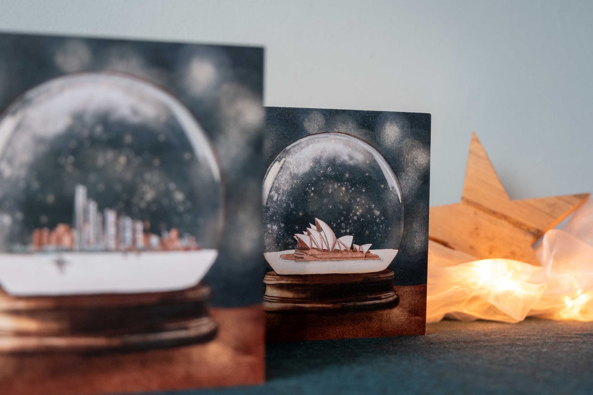
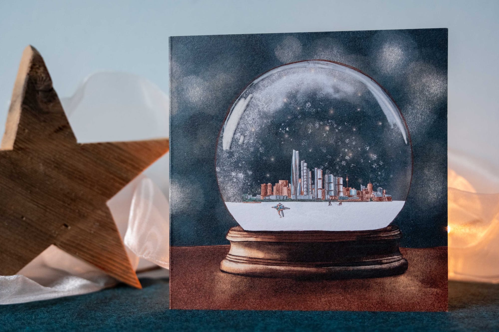
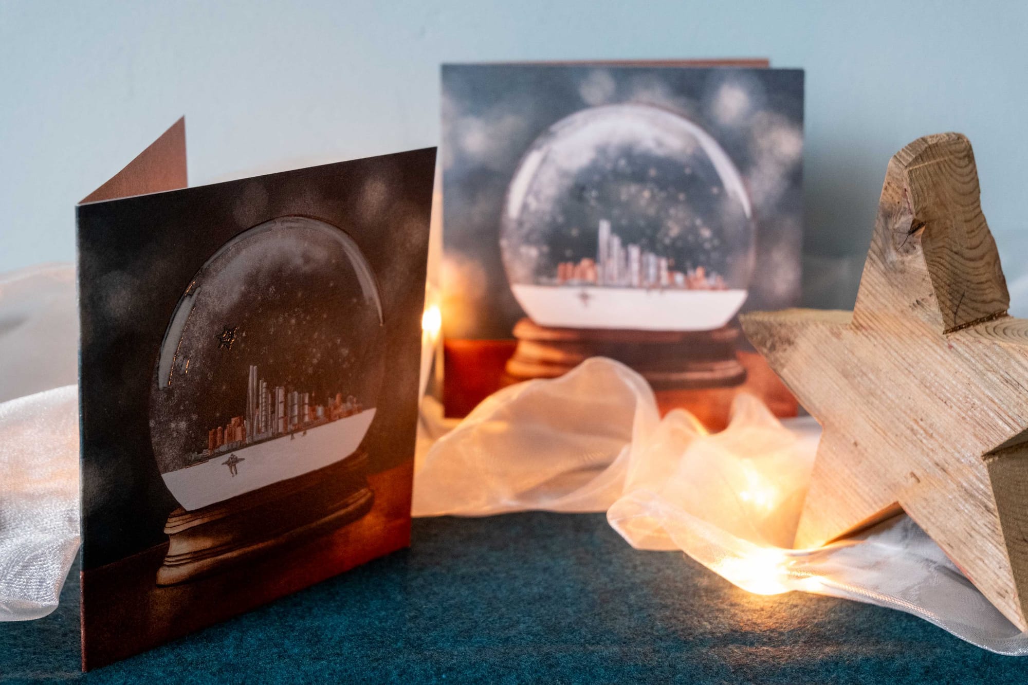
The final design took shape as a snow globe, with the Sydney Opera House and the Barangaroo skyline under that magical glass dome. I turned the harbor into a frozen sea, then added two small pairs of figures: ice skaters and sledders. A playful reference to the Netherlands. The client once lived in the Netherlands and later told me they smiled at that little detail, a subtle link between two very different winters.
Their reaction when seeing the final design said it all:
“I was curious what you would come up with, but this is something truly special! Very original and beautiful!”
The printing process and an unexpected compliment
For the printing process, I wanted the globe itself to shine, quite literally. Therefore I decided to use a so called: Spot UV finish. A glossy transparent ink that catches the light when you tilt the card. It’s a subtle touch, but it makes the globe reflect like real glass.
A few weeks later, I received an unexpected message: the printing company wanted to feature my design on their “Meesterwerken” (“Masterpieces”) page. I was thrilled and honored, to see my card showcased among other creative beautiful and inspiring projects. It felt like a small celebration of what happens when imagination meets craftsmanship.
Imagination becomes reality
By now, these cards have found their way to mailboxes across Australia and other places all over the world. Therefore I now can share this whole story with you. I love imagining them on mantelpieces or desks, catching the light just right so that the Spot UV finish gives off a tiny sparkle.
This project was a joy to work on. It was something quite different from birth announcements or wedding invitations, but equally fulfilling. It reminded me how much energy comes from translating an unusual idea into something real.
Sometimes all it takes is imagination to turn a crazy idea into something beautiful. So if you ever find yourself thinking, “Could this even work?”, my answer is, let’s find out together!