Turning complex science into visual storytelling
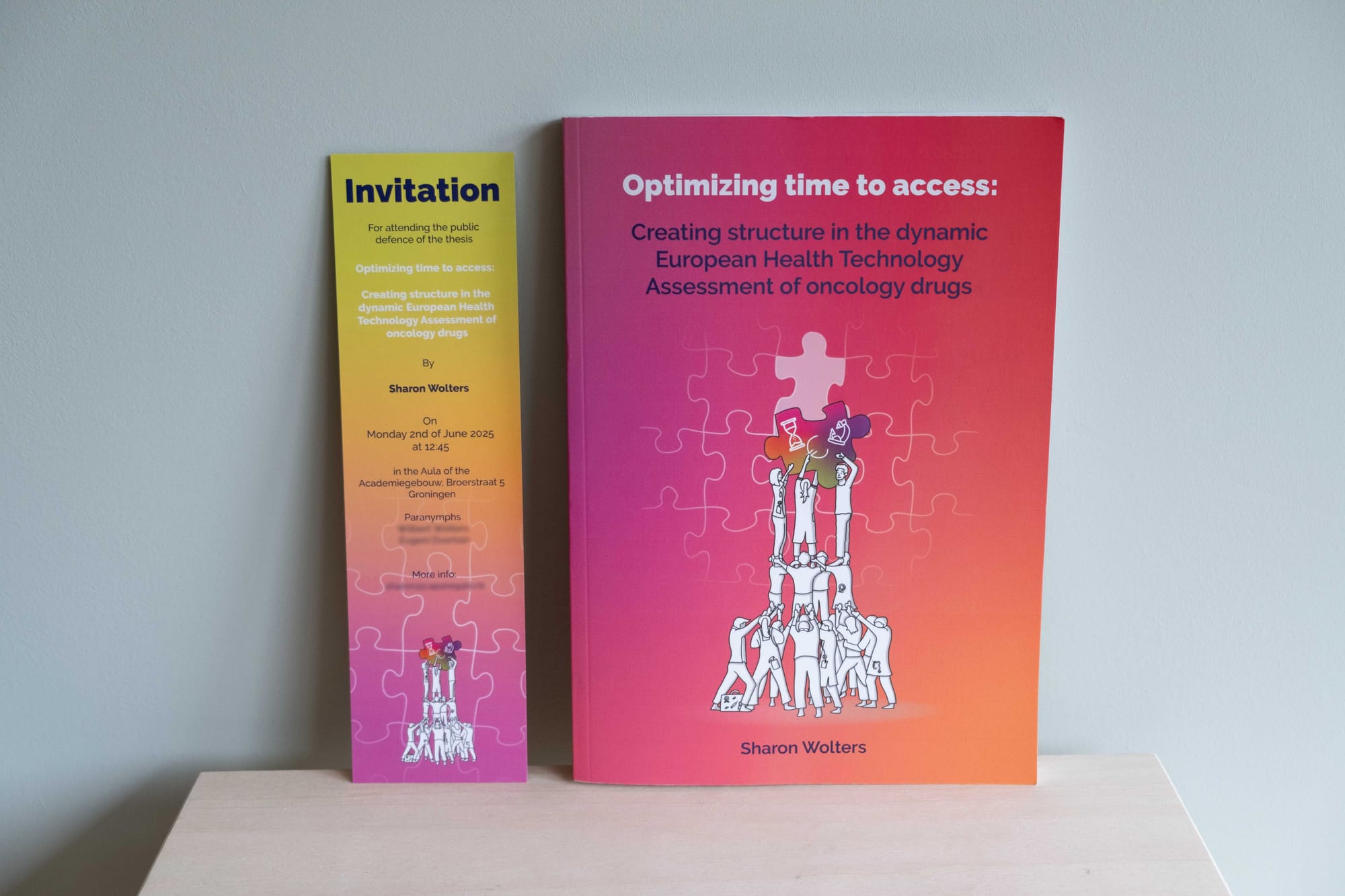
Recently, I had the pleasure of working on a very special project: creating the cover design and chapter illustrations for a PhD thesis booklet. The topic? Optimizing time to access of oncoloy drugs. This research explored how the assessment of oncology drugs can be optimized to shorten the time to reimbursement recommendations and promote equitable access across Europe. And all this within the dynamic and fragmented landscape of the European Health Technology Assessment.
Sounds abstract? It is. But also very fascinating!
The PhD-researcher, Sharon, approached me with the idea of visually supporting her thesis. While she already had some concepts in mind, many of her ideas were cinematic or movement-based. Challenging, since we needed to translate those ideas into static illustrations. Her key request: something colorful, something that could make the content feel alive.
We spent two evenings together, diving into her research, the different articles, and the structure of the booklet. As we spoke, I noticed she often used metaphors—puzzles that couldn’t be solved, people looking at the same thing but seeing something different, or a seesaw balancing money and patient benefit. These metaphors became my starting point. The creative process evolved from a mix of ideas, notes from our conversations and rough sketches into more developed concepts, which I refined step by step based on ongoing feedback.
Knowing Sharon has a vivid imagination, a great sense of humor, and had spent many holidays in Spain, I drew inspiration from the castellers—the human towers built during Spanish festivals. These towers can only stand through perfect collaboration. This became a central symbol in the design.
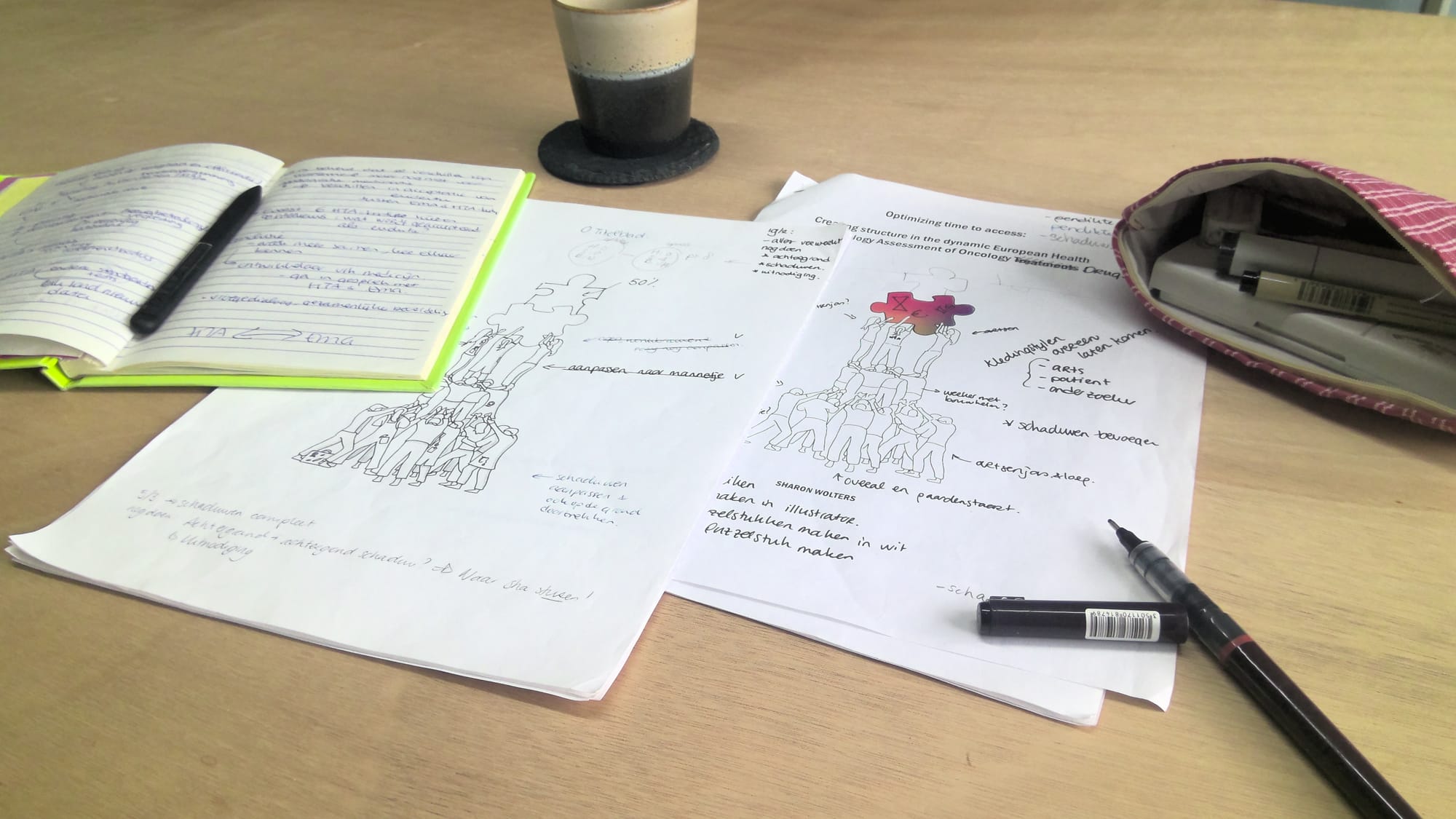
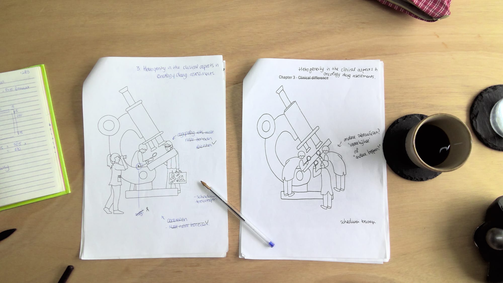
Taking notes, making sketches, improvements and adjustments and again and again...
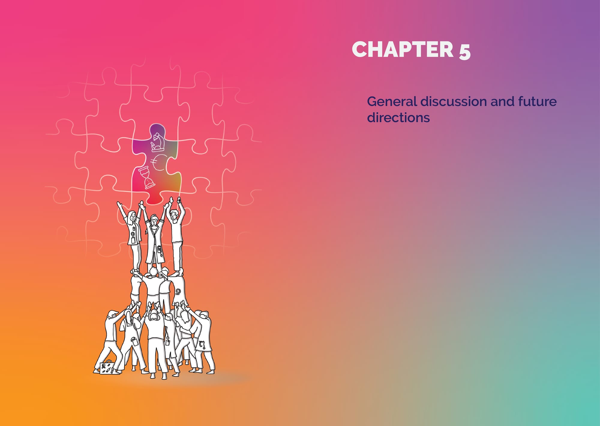
The cover illustration features such a human tower. At the top, three figures try to place a puzzle piece—but it doesn’t quite fit. The foundation is there, the intention is strong, but something’s still off. Time, money, and research are not yet in harmony.
Each chapter illustration builds on that visual story:
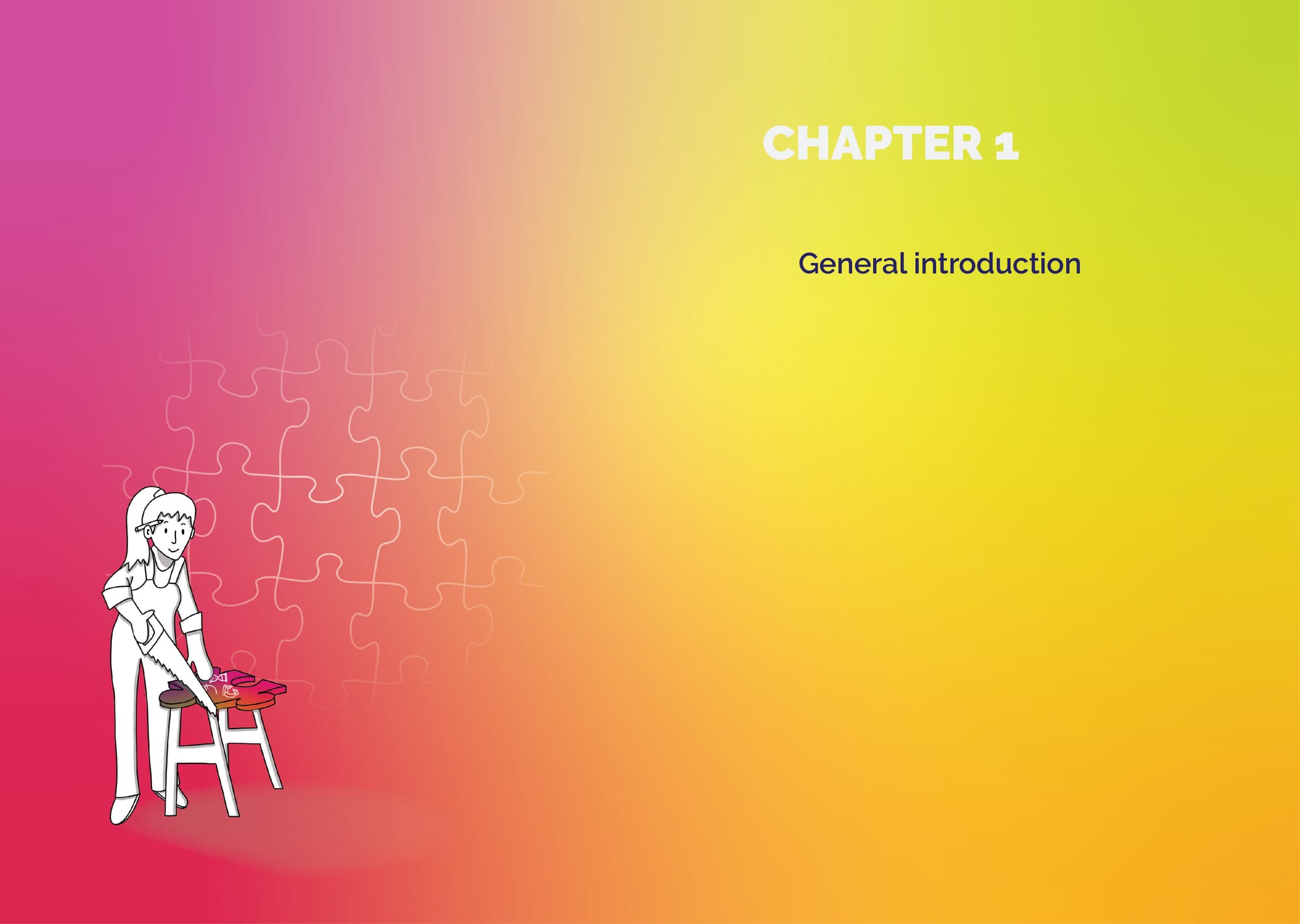
- In the introduction, a craftswoman saws a puzzle piece into shape—getting ready to make it fit.
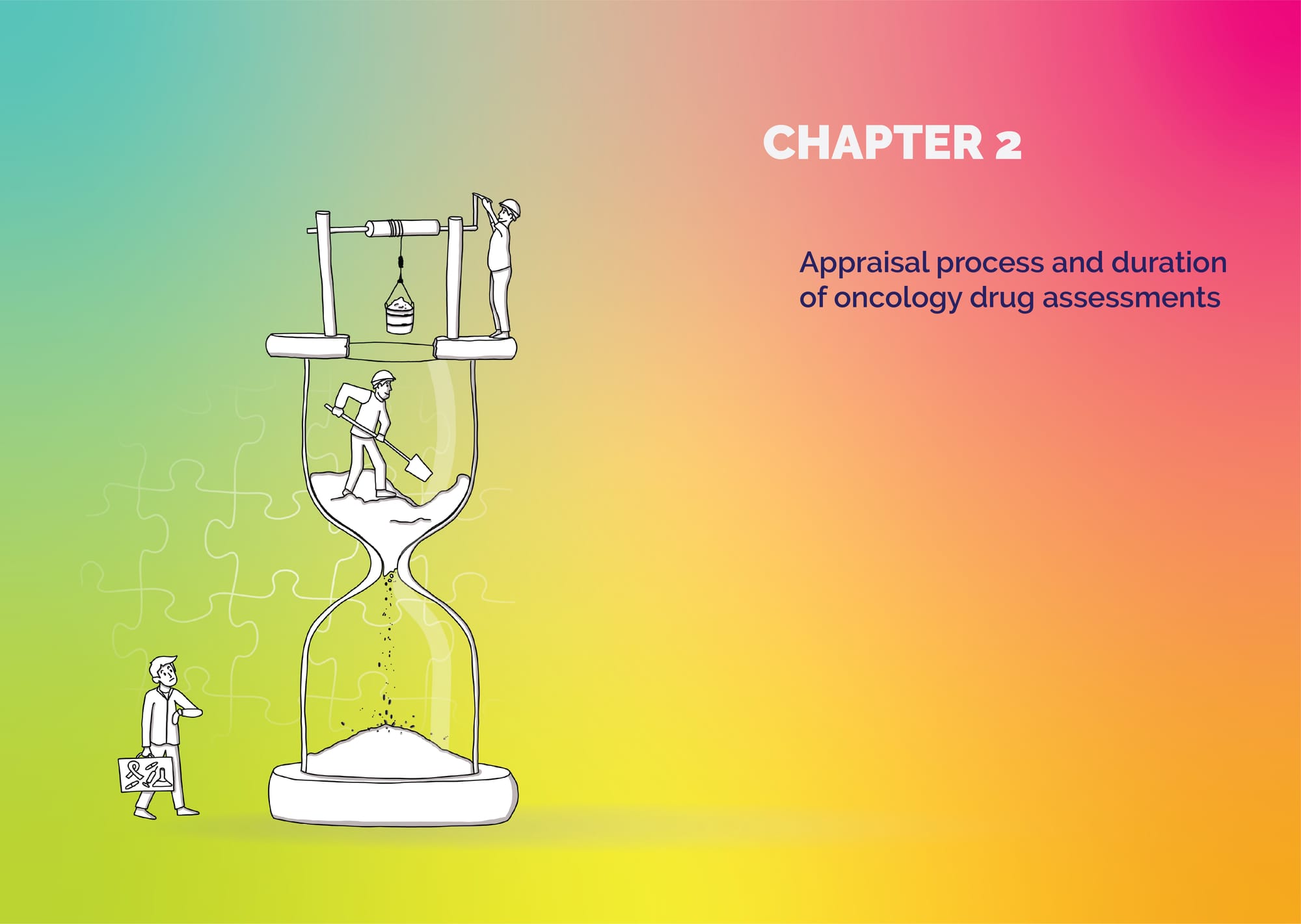
- Chapter two, focused on time, shows two men inside a giant hourglass, literally scooping out sand to speed things up. While a farmacist with a suitcase with the medication in the hand is checking the clock.
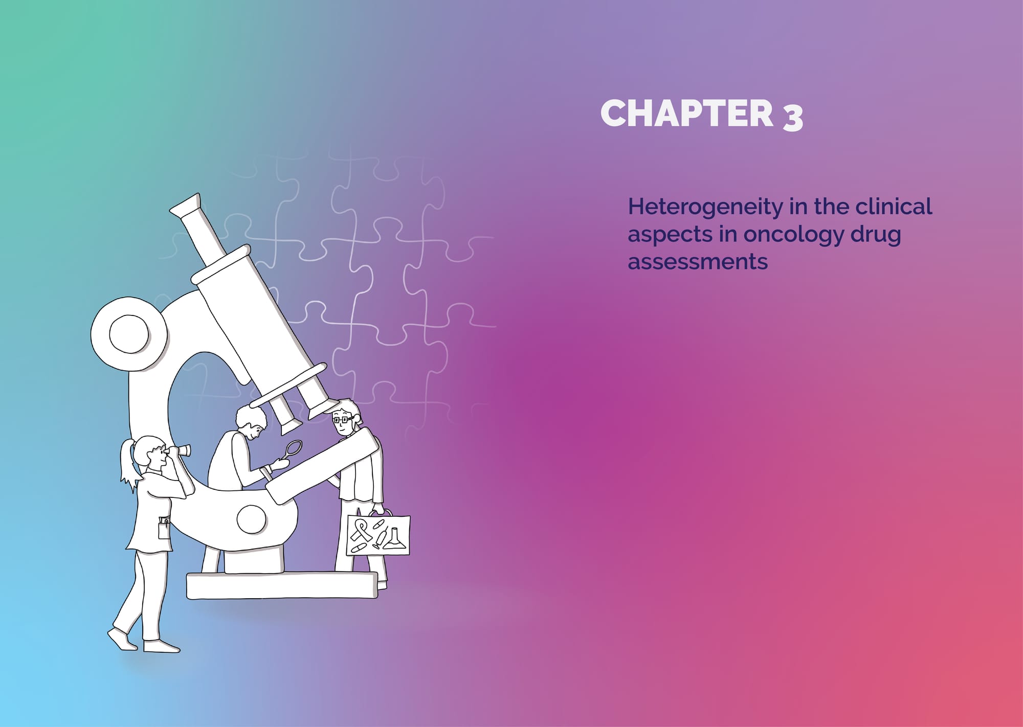
- Chapter three deals with differences in clinical evidence requirements. Here, a diversity of researchers surround a giant microscope, each peering through a different lens—be it binoculars, a magnifier, or glasses.
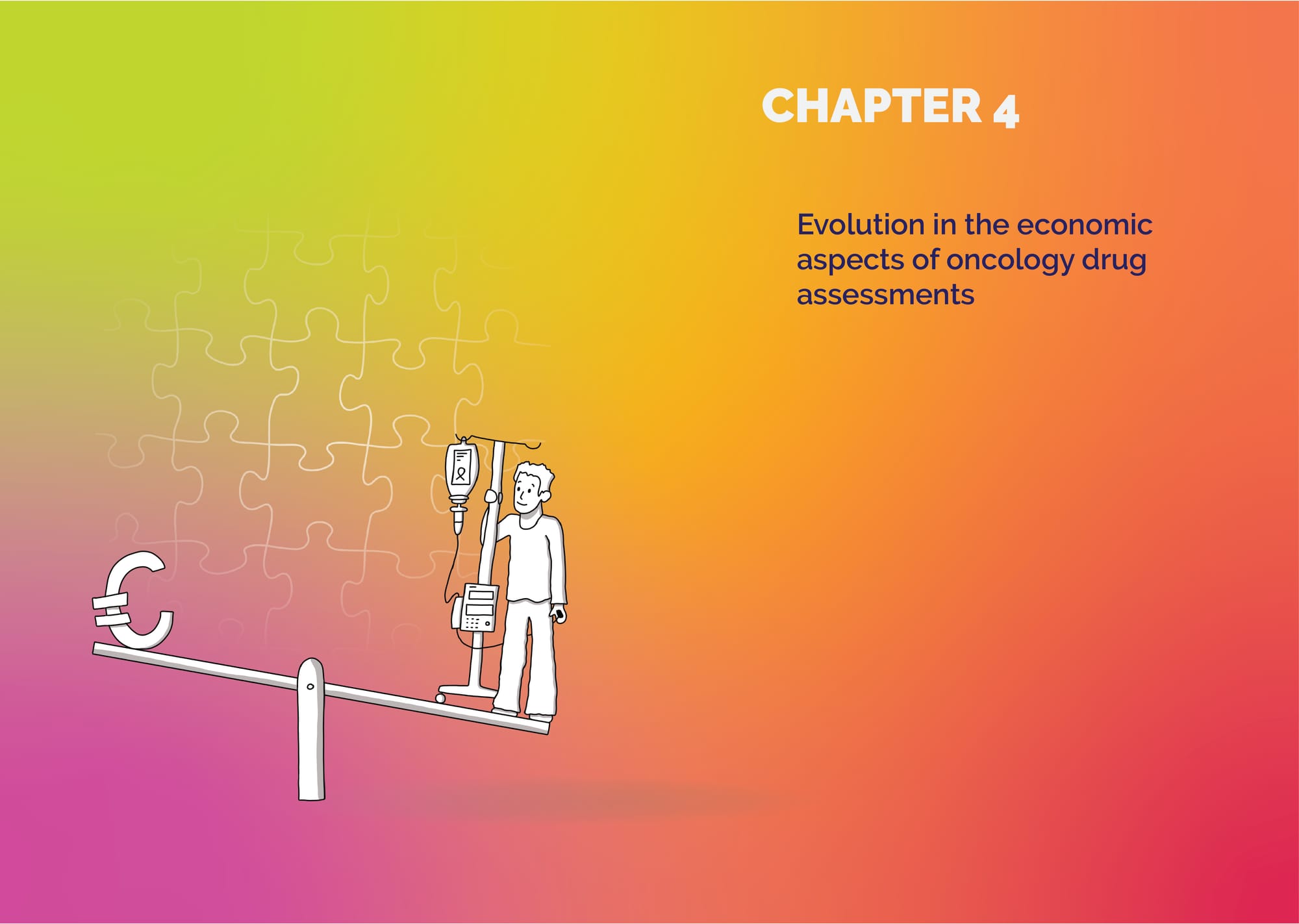
- Then comes the economic angle: a seesaw balancing a patient with an IV pole on one side and a huge euro sign on the other. The imbalance visually represents the tension between cost and patient benefit.
- The final chapter—the discussion—brings everything together. The human pyramid is back, but this time they’re celebrating. The puzzle piece fits. The message: be prepared, collaborate, streamline, and embrace uncertainty. The pyramid includes all key characters from previous chapters: Researchers, doctors, patients, HTA-representatives, the pharmaceutical figure and even the craftswoman.
All chapters
After all illustrations had been carefully reviewed—by myself, Sharon, and the printer—the moment of truth arrived: the proof print. Thankfully, the quality was perfect. The colors came out exactly as we had envisioned—vibrant yet balanced.
Not long after, I received a printed copy of the final version of the booklet, along with an invitation to attend the thesis defence at the Academy Building of the University of Groningen. A special moment, for me too!
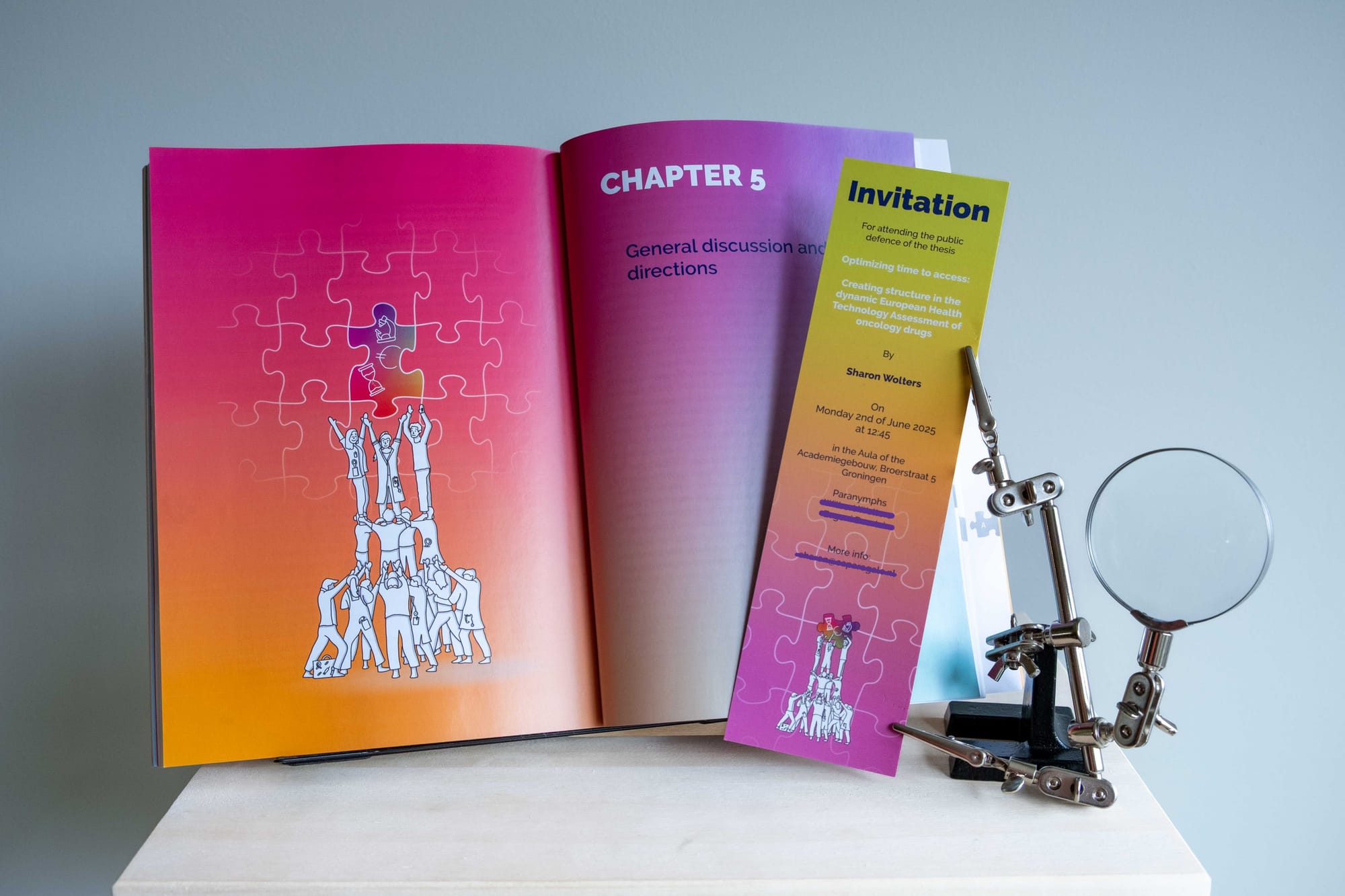
In a beautiful historic hall, surrounded by professors, researchers, and supporters, Sharon confidently defended her work. It was wonderful to see how she, her paranymphs, the opponents, and even the audience all holding the booklet throughout the ceremony. The visuals were not just decorative—they became part of the conversation.
The defence went just as it should. Some of the opponents even took the time to compliment Sharon with the colorfull booklet and its symbolic illustrations. Resulting in a huge smile on my face. And then it was official: the PhD-student became Dr. Sharon Wolters. One of the nicest pieces of feedback I received from one of the attendees was that the illustrations helped make the abstract and complex content more accessible—especially for people less familiar with the world of health economics and drug assessment. And that, to me, is what visual storytelling is all about: helping people feel and understand even the most complex topics.
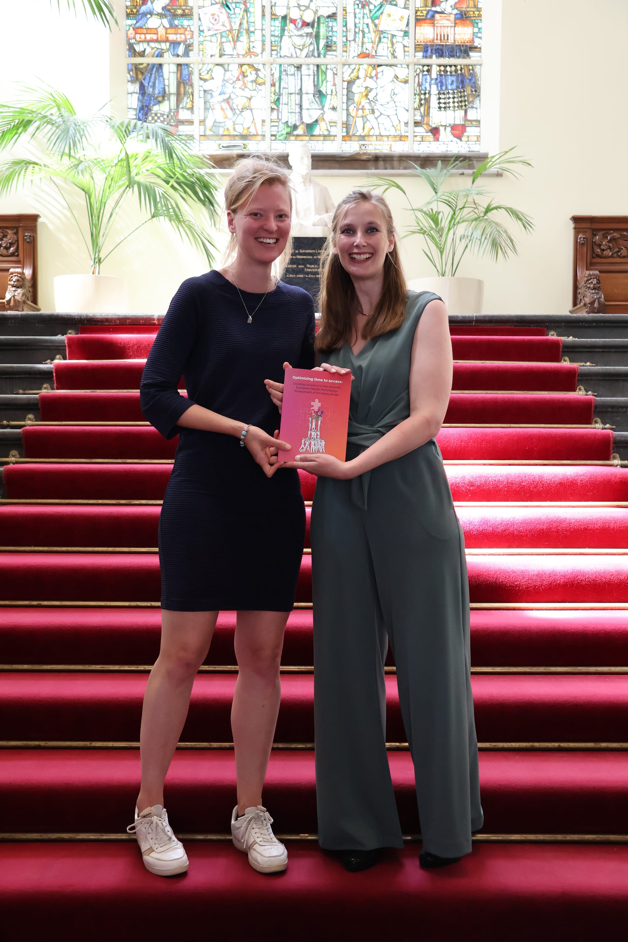
That beautiful and proud moment—for her, and for me too—was sealed with a photo on the grand staircase of the Academy Building. Just the two of us, holding the finished booklet, smiling!
